
Clients
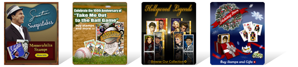
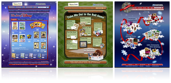
The Postal Store @ usps.com
Working for The Postal Store, the e-commerce side of the website of the United States Postal Service, since early 2008, I've created many promotions and ad units, and have had the opportunity to work in a variety of projects.
Each promotion usually includes multiple sized banners using common themed elements, which are then presented in different locations throughout the website, along with a dedicated webpage where all products related to that particular promotional series are then displayed in a custom layout, and made available for purchase.
The dedicated promotional webpages are created using HTML, CSS, and JavaScript code.
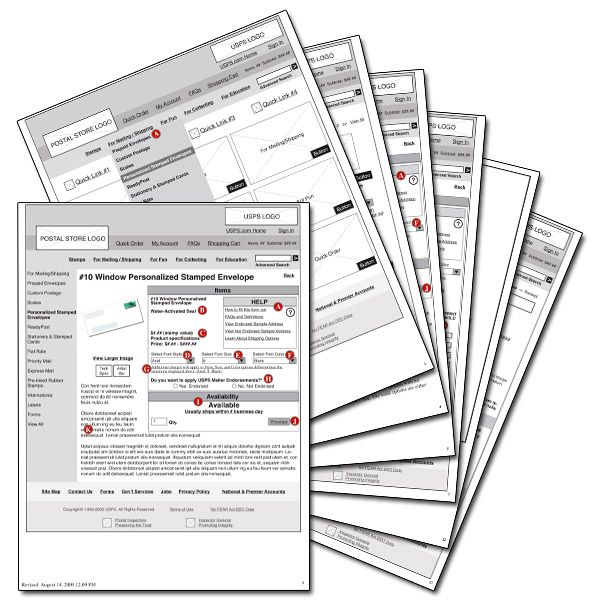
As a government entity, these pages must also adhere to Section 508 Accessibility Standards and are published only after a series of tests, reviews and approvals based on rules established for compliance by The Rehabilitation Act.
In addition, usability guidelines are a basic consideration for the creation of such promotional webpages and of new product webpages. This way, experience is equally important in the use and design of wireframes, presentations, and proposals, as well as in the implementation of the new designs.
Casa Café
The owners of Casa Café contacted me referred by another client.
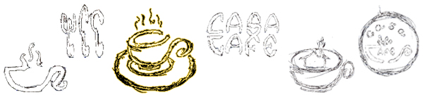
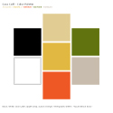 I start most designs by sketching options that could be applied to it. When a logo is created, usually one of my priorities is to make sure the logo works successfully in black and white first. Once that is presented to and approved by the client, color is applied to it. The basic color palette I selected to use for this design relates to the hues used in the interior decoration of the coffee shop.
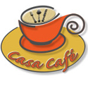 The owners of Casa Café wanted an attractive logo that could represent the nature of their business. Besides the feeling of a dynamic atmosphere, they wanted clients to intuitively know that they are more than coffee... just by looking at the logo, they wanted clients to understand that light fare is also served.
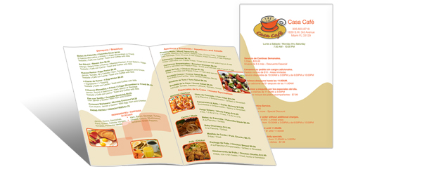
After the logo was created, a menu was designed. The menu is coherent with the logo in a way that all of the design elements were added to it successfully.
United Drywall International
Working for this international company was truly a challenge. This was a bilingual project that involved many pieces and close deadlines. Most pieces had to work and be designed in English and Spanish.

The logo and stationery were created. The stationery design was not just limited to business cards, letterhead, and envelopes; but it also included presentations in PowerPoint and interactive PDFs, invoices and credit applications. Uniforms were also designed.
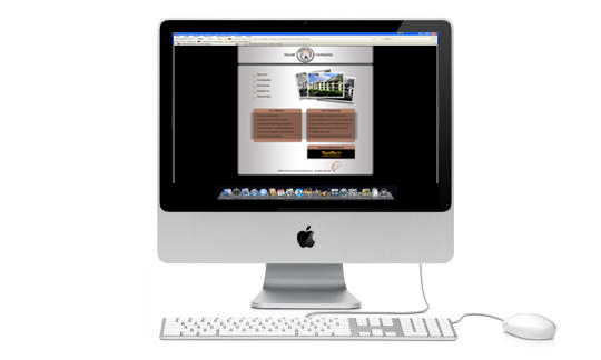
In addition, a website was created. The website provided information about the company and their experience, displayed slideshows of different projects the company concluded, allowed clients to download forms and presentation files in both English and Spanish, and also provided the means for clients to upload blueprints of floor plans needed for each business project. It was robust but intuitive.
©2020 maria guerrero — all rights reserved.