

Portfolio
Corporate Identity
The colors used in the Cavallino Olive Oil Exports logo are considered rich colors that communicate status, tradition, and indulgence. They are not meant to look ostentatious, but sophisticated in tone to evoke the textures and flavors of luxury and comfort with understated elegance. These colors are perfect for gourmet products and experiences, and for products for which tradition is central.
The placement of the logo creates a very corporate look that can be carried throughout the many pieces of its stationery, whereas the clean and open layout grabs attention. Here we find samples of Business Cards, Letterheads and Envelopes, as well as additional system elements such as Invoices, Mailing Labels, and Employee Uniforms. Also here, samples of system ads such as Magazine Ads, Billboard Ads, Truck Graphics, and Brochures.
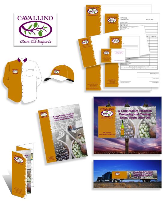
In addition to these pieces, a detailed Graphic Standards Manual was created as a guide toward the understanding of usage of the name and logo. When used appropriately, it contributes to a consistent image for all pieces of communications.
Ad Series
These pieces follow a sequence reflecting the continuity and consistency of the theme and design.
Each ad evokes the purpose of the product: relaxation.
The colors are the visual representation of clean air, fresh water, and indulging aroma, all of which are part of the product description and the principle of aromatherapy.
The layout, with its lack of straight lines and strong used of curves, defines the identity and target market directed to a female audience. The ads can be part of any publication, printed or online.

Editorial Design
This cover, contents page, and articles were created following the design process. From research and concept development, creating sketches of different layouts, producing the photography and illustrations, applying the most appropriate typography solutions, creating mock-ups for presentation, to the final printing requirements.
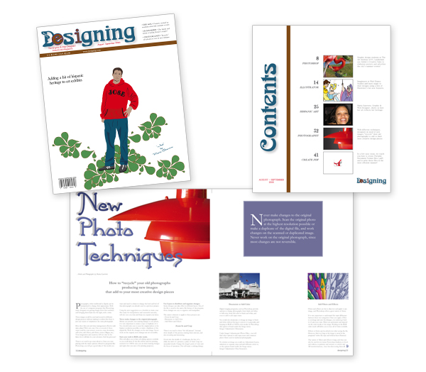
The content of each article was also created based on research and simplified ideas after brainstorming.

©2020 maria guerrero — all rights reserved.